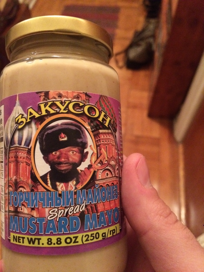
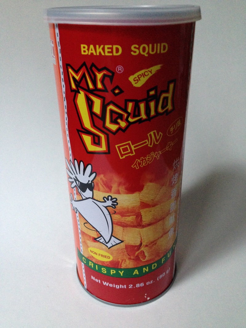
As is often the case, I purchased the undeniably radical Mr. Squid, sourced from the tiny Bangkok Center Grocery on Mosco Street, primarily because of the packaging, which in this case is perfectly suggestive of the faux-badass decorative t-shirts I favored as a four to eight-year-old. As a committed adult, I’m now forced to settle for four dollar tubes of fun, crispy (but non-fried) squid to show off my gnarlier side. In terms of packaging, Mr. Squid serves well in this regard, with canister art depicting the snacks in a fashion redolent of rigatoni (or bundled hay?) resting in a pile amid a heat-streaked miasma of fire, dust and haze. Yet despite the design bona fides and the decidedly groovy mascot - who sort of resembles a wind-inflated kite mounted with a sunglasses-clad feather duster - these unfortunately tasted a bit like fish food smells. They may also taste like fish food tastes, although I cannot say with any real authority. I’m not the only one who feels this way, but as always, I’m willing to mark this down as a difference of tastes, a cultural gulf between the snacking proclivities of Thai fish fanatics and gormless American potato munchers like myself. In an effort at conciliation, I will be making a real effort to hire Mr. Squid as the official mascot of Snack Semiotics. Imitators beware.
0 Comments
Following up on the Russian theme of the previous post, it seems as good a time as any to delve into this mysterious mayo/mustard combination, bought at not-great cost from the great NetCost supermarket in Sheepshead Bay. The use of a black man as a logo (silent spokesman?), one whose connection to either mustard or mayonnaise seems highly tenuous, seems to be aiming for humorous (perhaps through the overall oddness of this goofy-faced fellow touting a characteristically Russian product?), but lands closer to cringe-inducing. I could, perhaps, leave it at that, writing this one off to a poor choice made from the remove of an often not-so-tolerant culture, but as always I feel impelled to push further, toward the exact set of circumstances that led to this specific abomination of design. Despite heavy Googling (over 30 minutes logged, at least), I found only scant information online about this product, although one clue is that the spokesman appears (at least from my barely-informed outsider perspective) to be dressed like a robe-cloaked Orthodox priest, albeit one clad in an ushanka while gripping a hammer and sickle mounted on what might be a crosier. Or a crucifix? Specifically a blessing cross?
The brand name itself refers to Zakuski: the traditional spreads of light snacks intended to be consumed with vodka. This guy (who, to raise hackles further, appears via a photo whose quality noticeably clashes with that of the illustrated onion domes behind him) also shows up on two horseradish mustard variants as well as horseradish beets, which to me indicates a possible (linguistic?) association between blackness and horseradish itself, especially since this mustard/mayo mix also has a noticeable horseradish zing. The brand's other jars typically feature a more ordinary Russian babushka, with the version shown here specifically described as “Teshchina Gorchitsa,” or mustard from Teschin (a bridge in Odessa). This indicates these spreads may not even be Russian to begin with, although another source does transliterate the word to Tyosha. The latter makes a bit more sense, since Teschin Bridge does not seem nearly impressive enough to have a mustard named after it (assuming, of course, it never served as a site where famous home-made mustards were sold). There’s only so far you can go, however, without a knowledge of the language the item is originally printed in, and so I must call off the search before I go insane. The mustard/mayo (mustardo?) itself is pretty good, at the very least. |
The coded language of snacks, sandwiches and seasonings, in NYC and beyond.
Archives
February 2022
Categories
All
|